Filters
When working with reports, you can use filters to view specific data. Filters impact both grids and charts.
To filter data, click on the Filter button located in the top-left corner of the REPORTS tab.
This opens the FILTERS tab where you can create, group, enable/disable, edit, or delete filters as well as save filters as preset.

On the FILTERS tab, you can do the following:
Add filter
Selects a data source field that will be used for filtering.
Clicking on the Add filter button opens a tab where you can select the individual data source fields. To quickly find a specific field, you can use the search functionality.
Once selected, the filter will appear on the FILTERS tab. For each data source you choose, there is a drop-down menu with operators and a field for entering a filter's value.
You can add or remove as many filters as you need.
Additionally, use the toggle button to enable or disable filters.
If there are two or more values, operators AND or OR can be used.
Add Group
Adds groups of filters.
You can add or remove the whole group of filters at once.
All the currently applied filters are listed in the top-left corner of the FILTERS tab.
Presets
You can save the applied filter set for future usage. In order to do that, adjust the filter settings that you want to save and click on Save as preset on the bottom of the window. You can create multiple presets.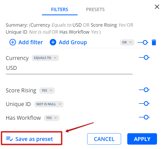
Name the Preset and click SAVE.

If you add or remove filters in a saved preset, changes are applied to the current report view but are not saved in a preset unless Save as Preset is clicked.
Charts
Also see: [Video Tutorial] Charts
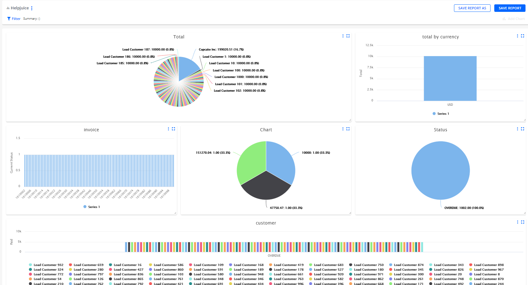
- Charts use the data from the report you are working in.
- The chart can be added to the report, which contains at least one measure data source.
- There are 3 types of charts: Pie charts, Column charts, and Line charts.
- You can add up to 6 charts for each report. The units are scalable, you can move and drag them.
- The charts are not exported to the excel report.
Pie Chart
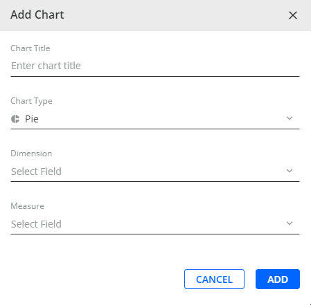
Dimension - values that are measured in the report
Measure - values which dimensions are measured by
Column Chart

X and Y axis - choose values to create a chart
Group by - the field can be selected to group selected values by dimension (X-axis Parameter)
Line Chart

X and Y axis - choose values to create a chart
Group by - the field can be selected to group selected values by dimension (X-axis Parameter)
To save created charts on the report click the SAVE REPORT button.

Chart Settings
This section describes how to customize a created chart:
-
Open the chart menu by clicking as shown below:

- Click on Settings to open the Chart Settings dialog.
-
Configure the Chart Settings dialog to suit your needs:

- Sort by - Defines which data column to sort the chart by.
- Data sorting - Defines whether to sort the data in the chart in an ascending or descending order.
-
Number of records - Specifies how many records to display in the chart.
You can display between 1 and 500 records. -
Logarithmic scale - Defines whether or not apply the logarithmic scale to the vertical (y) axis.
A logarithmic scale shows equal intervals between each order of magnitude instead of showing equal intervals between each value. This can be useful when the data being plotted covers a wide range of values, as it can make it easier to compare data points that are far apart. - Hide legend - Defines whether or not to hide the chart legend.
- Hide grid - Defines whether or not to hide the chart grid.
- Click on SAVE to save the chart settings.
